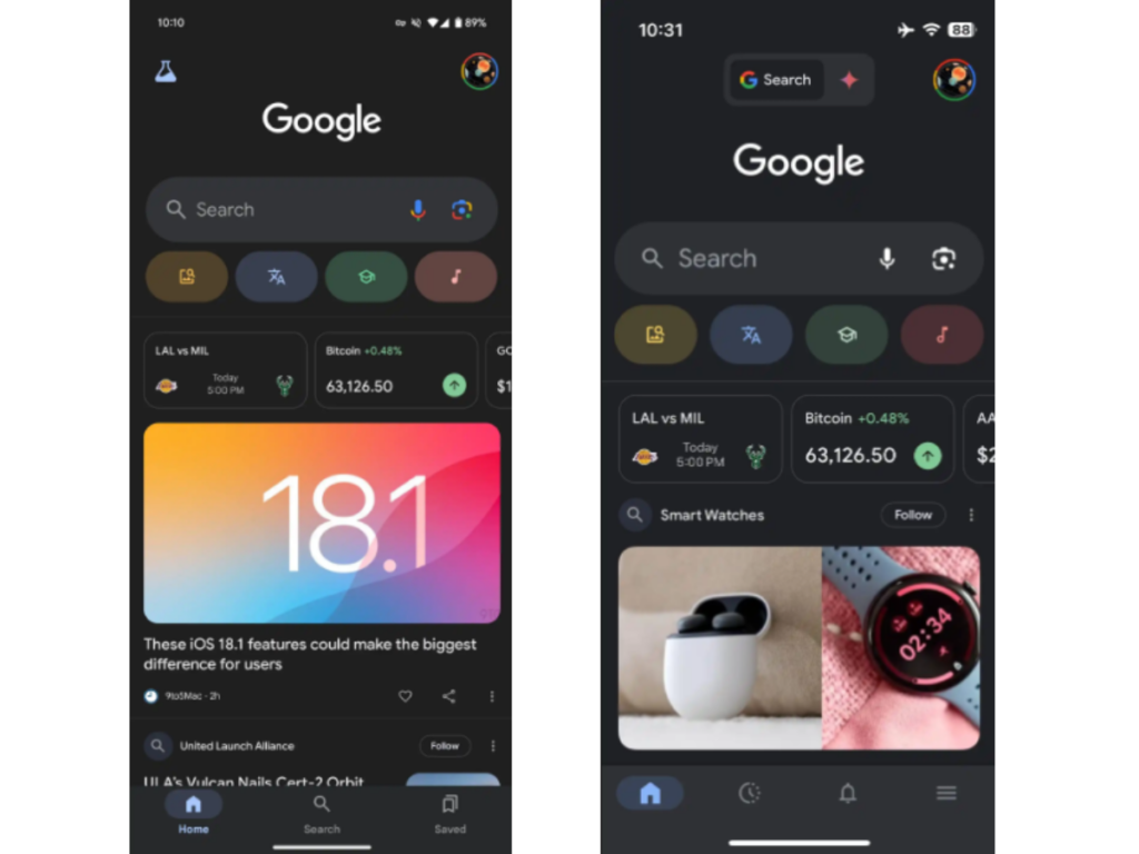
The Google App is bringing back its modern Material 3 design for the bottom navigation bar. In the latest beta version 15.40, users will notice a pill-shaped indicator around the tab they are using, making navigation clearer and more stylish.
Initially launched in 2023, this design was replaced but has now returned with improvements. Instead of simply highlighting the tab icon, the pill shape surrounds it, giving a fresh and appealing look.
Google App blue checkmarks
Google is also testing a new feature that adds blue checkmarks for verified businesses in its Search function, helping users identify trustworthy sources easily.
While not everyone has access to this beta update, you can try force-stopping the app in settings to see the new design. With Material 3’s return and new features in the works, Google App users can expect a better, more user-friendly experience.
The updated bottom navigation bar is available in the latest beta version 15.40 of the Google App, as reported by 9to5Google. This new design aims to simplify navigation for users, making it more user-friendly and visually appealing.


