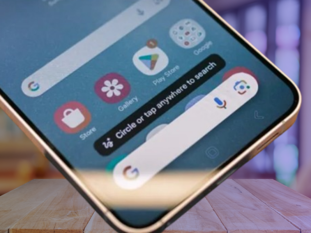
Google is updating its Circle to Search feature with a redesigned interface and a new app drawer. This change aims to improve functionality and pave the way for future features.
What’s Changing in Circle to Search?
- New UI Design
The latest Google app beta (15.45.43.ve.arm64) introduces a chunkier interface. UI elements are now placed inside rounded boxes, giving a refreshed look. - App Drawer Replaces Translate Button
- The Translate button has been replaced with an app drawer, allowing easier access to multiple features.
- The Google Lens shortcut and translation options now require an extra tap.
- Music Search Button Stays
The music search shortcut remains next to the search bar, but users are hoping Google will allow customization, such as swapping it for the Lens or Translate button.
Why the Change?
- More Features, Less Clutter: The app drawer provides space for new features without overcrowding the screen or search bar.
- Future-Ready: This update lays the foundation for additional functions to be added seamlessly.
Google Circle to Search Future Possibilities
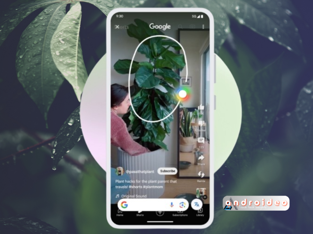
Google is also testing the ability to use Circle to Search in videos, though it’s unclear whether this will work for all videos or specific platforms like YouTube.

The redesign signals Google’s commitment to making Circle to Search more versatile and user-friendly. Stay tuned for more updates as these changes roll out!


