YouTube Testing New Video Player UI
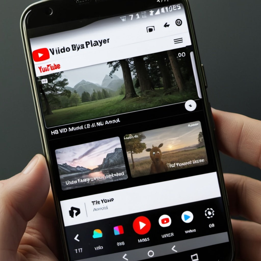
YouTube is currently testing a revamped Video Player UI for Android, bringing several updates aimed at improving user experience. However, opinions are mixed—some find the new design cluttered, while others see it as a useful upgrade.
What’s New in YouTube’s Video Player UI?
- Title and Channel Info: The video title is now placed above the progress bar, and the channel icon, subscriber count, and channel name appear together. View count and the video’s publish date are displayed below the title.
- Expanded Controls: The expand button has moved to the top left, and a new rotate button has been added. A second playlist button replaces the old expand button just above the progress bar.
- Forward/Backward Buttons: These are now hidden in fullscreen mode but appear in portrait mode when the video is paused.
- Action Buttons: The like, dislike, comment, and share buttons are now located on the right side, above the progress bar.
- New Features: A Remix button is shown by default, and there’s a new button for video chapters at the bottom left. The bookmark feature is moved to a menu.
- Swiping Gestures: Users can swipe up and down to switch videos in a playlist, but you can only swipe down to minimize the first video in the list.
The updated UI is still in testing, and YouTube is gathering user feedback before the final release.
This revamped YouTube Video Player UI is expected to bring a more interactive and seamless experience for Android users.


